In this tutorial, we are going over the setup of the Oslo Template:
- Different kinds of sites
- Announcement bar
- Navigation bar
- The social grid
- Footer
Note: if there are any words or terms you don’t understand, check out my Wordlist to see if it is explained.
Different kinds of sites
On the left side of your website editor, you will see a menu with all the different sites included in your Oslo Template (see image below). In this section, I will go through the different categories so you will understand what they are and how to use them.
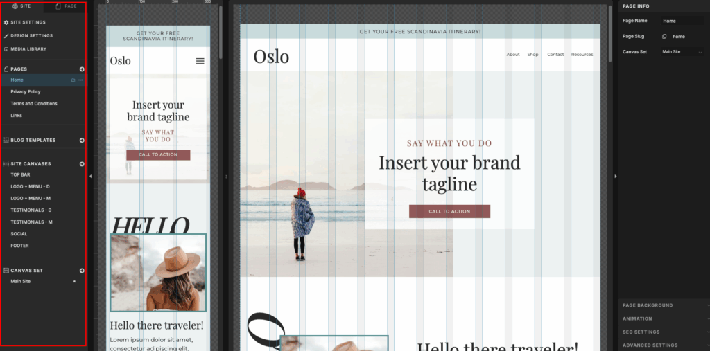
Pages
These are the full pages that are included in your template. In the base template, this will be Home, Privacy Policy, Terms and Conditions, and Links.
Blog templates
If you purchase a blog add-on, this is where the pages would be. This usually includes Blog, Single Post, Page, and 404.
Site canvases
Here you will find canvases that are used on more than one page. E.g., navigation bar or footer. When you want to edit one of the site canvases, you just have to click on it and start designing.
Canvas set
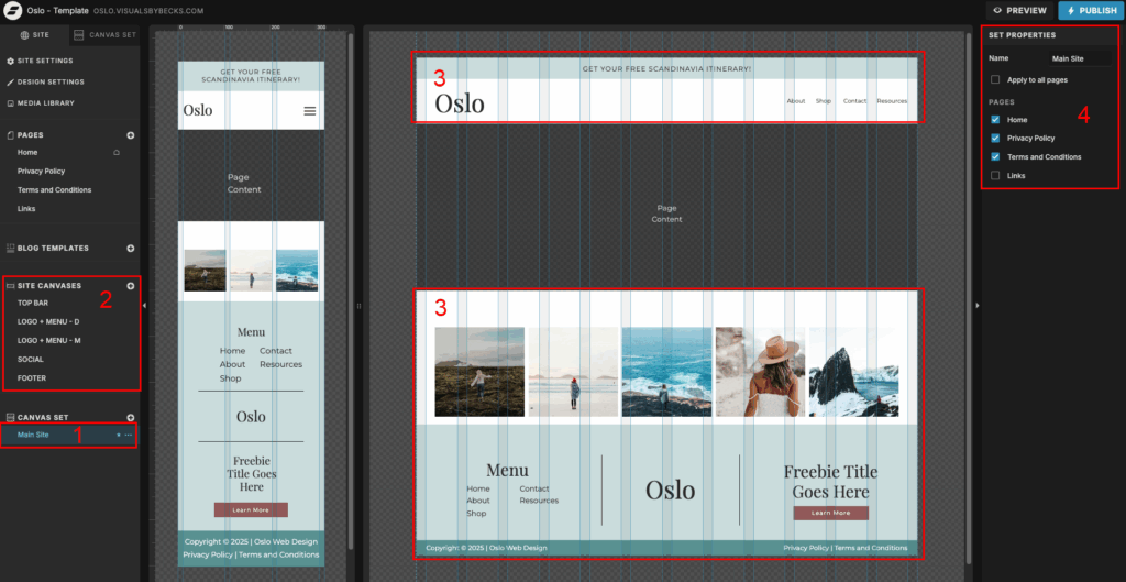
If you click on Main Site (#1), the canvas sets that are included in the Oslo Template, you will see different site canvases (#2) being put together to create a set (#3). In the Oslo Template, the Main Site canvas set includes the Top Bar, Navigation Menu, Social, and Footer. You can also choose what pages you want the set to appear on (#4). By default, the Main Site canvas is set to show on all pages except the Links page.
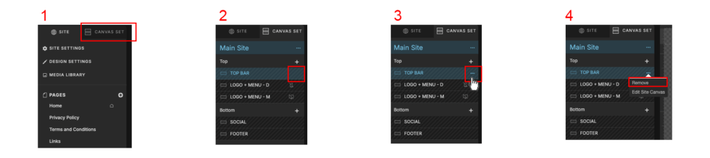
If you want to remove a canvas from the set, click Canvas set (#1), hover over the canvas you want to remove in the left bar (#2), and move it so the three dots show up (#3). Click on the 3 dots and click “Remove” (#4)
If you want to add it back you can click on the plus icon (#1) and re-check the canvas (#2), and drag it where you want it (#4). Note that you can only add a site canvas to a canvas set.

Announcement Bar
The Announcement Bar (aka top bar) is the top canvas on your page. You can either remove it or you can use it to your advantage. Examples of things you can announce are a sale or your top-selling item.
To change text, just double-click on the text and start writing what you want it to say.
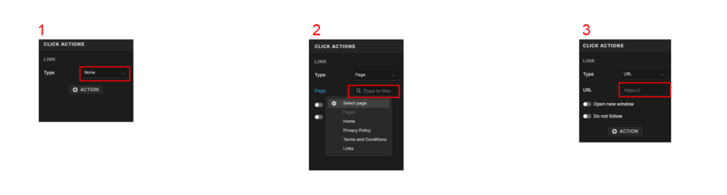
If you want it to link/redirect somewhere (for example, a download page), you have to click on the text, and on the left side, you will see an option called “Click action”. If you click on the type dropdown (#1) you can choose how you want to link it. You will probably use either Page (#2) or URL (#3).
Page = add a link to a page on your own website
URL = add a link to an external website

Navigation bar
There are 2 Navigation Bars, aka “Logo + Menu”, canvases. One is for desktop and one is for mobile. If you click on “Logo + Menu – D” you will see the desktop version, and if you click on the “Logo + Menu – M” you will see the mobile version. If you click on the Main Site canvas set, you will see both.
The reason I have created 2 different canvases is simply to keep it easier for you.
The desktop version is a pretty standard top menu where you can place the logo on the left side, and the navigation links are on the right side.
The mobile version also has the logo on the left side, and on the right side, you see a hamburger menu icon. If you click it in preview mode in the top right corner, you can try it out and see that a dropdown menu appears.
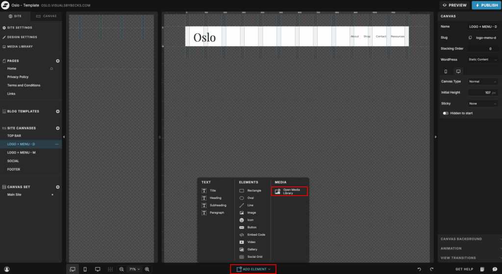
Logo
In the Oslo Template, the “logo” is just a title element with the name written in it. If you want to use your own logo, just delete the element and upload and add the logo from the Media Library (see image below).
Navigation links
Since the Oslo Template is a one-page website, the links in the menu take you down the main page (click preview at the top to see how it works).
When you click on one of the links (in this case “About”) and go to Click Action, you will see that it is linked to: Type: Page -> Page: Home -> Canvas slug: about
“Type” is what type of link it is; here it goes to “page,” which is a page on your website.
“Page” is what page it is going to. In this case, it’s “Home” as the about section is on the Home page
“Canvas slug” is the name of the canvas you want it to scroll to; in this case, the canvas is called “about”.

If you need to find out what the slug for a canvas is, go the the page the canvas is on, and click “page” (#1) at the top. Here is a list of all the canvases on the page (#2). First, you click on the canvas you want, then you double-click on the name of the canvas (#3). In the pop-up, you will see the slug name (#4). It will be the same as the name of the canvas. If the name has a space, it will be replaced by a hyphen, and uppercase letters will become lowercase (e.g., “Seen On” becomes “seen-on”).

Note: if you change any link names or canvas names, make sure to double-check that the links still work as they should on both desktop and mobile view.
To add more pages in the navigation bar, you just have to choose one of the links already there, copy + paste it, and move it around as you please. It might take some adjusting to get it exactly as you want.
Social Grid
The Social grid is where you can link your Instagram account to show images from your feed. To connect your account, click on the grid and then on manage accounts on the right side. It will take you to your dashboard, and from here you can connect it.
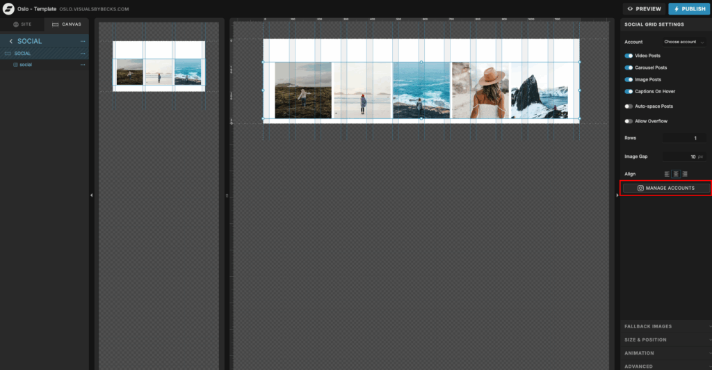
When you have connected your account, you can play around with the Social Grid Settings.
If you don’t want to connect your Instagram account, but still want the grid, you can choose to add fallback images. You will see that this is the case for this template when you import it. Find Fallabk images on the right side and click manage images.
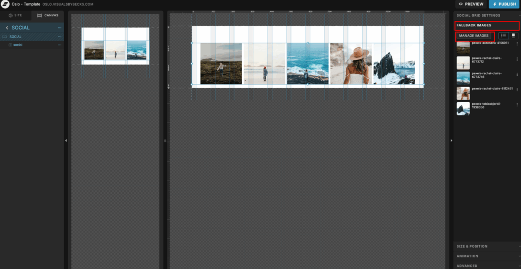
When you are inside the Media Gallery, choose the images you want to use by hovering over and clicking on the checkmark, making it blue (#1). Then you move them over to the Gallery by clicking the arrow (#2). When done, click “save” (#3), and they should automatically be added to the grid.

Footer
Finally, we have the footer. Here you have another menu, you can choose which links you want to have here. Make sure the links go where they should.
Then you have the logo again. Switch it out to your own logo.
Lastly, you have the call to action section. Add something your readers might like.
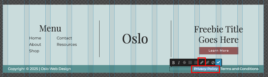
The banner underneath the footer is part of the footer canvas. Here I usually put the copyright info, and the links to the privacy policy and terms and conditions. These are inline links, so you will have to select where the text you want to use as links, and a pop-up will appear over the text. Here, you can click the link button and link to the page or URL you want.
As you can see in the image below, I have linked it in the same way others are linked.
Conclusion
And that’s it for this part. It’s pretty simple. Showit is a very easy tool to use, and don’t be afraid to try and click around. If there is anything you need help with, feel free to contact me here.